
Route Fifty
A Redesign
Problem Statement
Route Fifty is an online journal publication concerning itself with news and policy impacting those in the government and public sectors of the work force.
Route Fifty is a digital publication, meant to be a springboard of information for government workers. This website looks crowded and navigation is not intuitive. While acceptable for exploitative work, user frustrations are related to navigation and stylization.This forces people to “bounce around” the website looking for relevant articles. By streamlining the homepage, and addressing their navigation my goal is to make this site easier to use, connecting people to the data and stories they need to make educated policy decisions.
Research
Learn about the technology people use to consume information
Learn about the kinds of sites that people do enjoy using and what differentiates them
Explore the most common frustrations users experience on any news site
Understand what keeps someone engaged on a site, and what drives them to leave after looking at the homepage.
Objectives
Time: little time to user test on existing products due to the short nature of the study
Number of test users was limited to the availability of participants within this time frame
Limitations
Competitive Research
A SWOT analysis was conducted on 2 alternatives to Route Fifty. Government Technology and Federal News Network
A look at alternatives to Route Fifty


User Interviews
A total of 4 people were interviewed
Interviews were done 1 on 1 and lasted about 40 minutes
Interviewees are from around the Bay Area
Simple usability and screens that were not cluttered was brought up in every interview. One user brought up “reader view” multiple times as the reason to return to certain sites.
Paywalls were brought up as a deterrence from perusing articles.
Getting annoyed or confused by distractions whether the site was too loud or there were too many sponsored messages was a frustration brought up by every interviewee ·
Learnings
“Like it’s easy to read, they separate everything from like technology… I like that you can tell like, Oh! this is sports, this is opinions, as compared to like the New York Times, immediately, first things first, like the first thing you see on the times is “subscribe!”

Personas

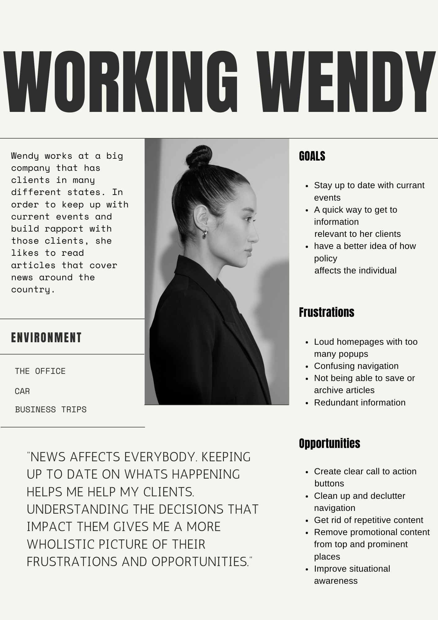
Both of these personas are the result of the research phase of this project with an emphasis on interviews and secondary research.
User Flow
Proper drop down menus allow users to browse news topics without having to leave the Home Screen.
Related topics are grouped together for easy navigation
This user flow shows the journey one takes to search for the article they want.
finding the right article

Design
Crazy 8s and wireframes

Adding state and federal news tabs to the home page, as well as the implementation of a drop down menu allow the user to explore relevant topics without bouncing around the website
Prioritizing clean lines, clear groupings and an intuitive menu was a priority in design
Prototyping
Main Task: Looking for the Right Article


A mid fidelity prototype was created in order to test the navigational functions of the home page and address any usability and accessibility concerns.
Certain actions were limited or disabled in order to focus attention on certain aspects of the user interface
User Testing

Users
One woman, 33 Foster City. Formulation Scientist
One woman 31, Saratoga. Animator
One man, 40, Mountainview. Postdoc.
Tasks
Ask the test user to navigate the prototype and find an article on cybersecurity in schools.
Ask the user to navigate back to the home page.
Ask the user to navigate from federal to state news.
Settings
Each user test was conducted at the user’s home
Each test took about 10- 15 minutes.
Tests were conducted in early evening.
Each user conducted the study on their own laptop.

Learnings
Both users commented on the home page looking clean. When asked to expand, they mentioned lack of pop-up advertisements which clutter most online journals.
One user mentioned that the “state/Federal” tabs looked cluttered under the Logo.
Users appreciated the register button not being “aggressive”.
One user mentioned she liked the menu because the drop-down feature allowed her to browse subjects without leaving the page.


Reflections
Takeaways and Next Steps
Playing around with layout and menu allowed me to explore visual cues and the ways in which different news outlets may prioritized information and articles
Users appreciate being able to clearly navigate topics without having to leave the homepage.
Reducing the steps to search for information lowers the initiation barrier in following through with tasks.
Continue to make iterative changes to the menu with further research.
An open card sort would be optimal to gain a better understanding of how people group content and title subjects.

